Sector(s)
Team Members
Project Team
- Alyssa Varsanyi, UI Designer — Qualitative research, visual design, design components
- Ashley Estes, UX Architect — Quantitative research, information architecture
- J. Hogue, Director of Design & UX — Strategic oversight, UX and design consulting
Visit the site
Visit the siteOrganizations Involved
Community contributions
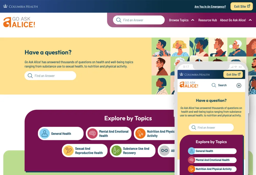
We cultivated a passion for this feature through our research and have written an article detailing our best practices for implementing a quick exit button. Additionally, we have created a Drupal Module for this feature so that more people can implement this important tool for sites with sensitive content.
Mass Legal Help (MLH) is a website dedicated to supplying trustworthy information about legal issues throughout the state of Massachusetts. They provide easy to understand and easy to find resources for those who might be stressed and surprised by a legal notification. Its parent organization, the nonprofit Massachusetts Law Reform Institute, needed to modernize the site to increase usability, navigation, and accessibility. Oomph was ready to discover, strategize, and redesign the entire experience from architecture and taxonomy to page designs and safety features.
About the project
Powering Design With User Feedback
MLH helps Massachusetts residents find information to solve common legal issues, like securing public benefits or fighting an eviction. Every aspect of the site needed to be grounded in the audiences’ needs, therefore Oomph interviewed real people during the discovery and design phases who fit MLH’s primary and secondary audience profiles.
By performing a thorough discovery process — including working group interviews, visitor interviews, cohort site analysis, and wireframe and prototype testing — Oomph was able to create a successful site design dedicated to the needs of visitors.
Helping the Audience by Understanding Them
MLH shares insights on heavy topics ranging from housing and homelessness to money, debt, and immigration. The site contains sensitive information that could change their visitors’ lives. Oomph’s main goal was to step into the shoes of their user groups to better understand their needs when they seek legal information.
The main audience of MLH is Massachusetts residents who are primarily low-income and may not speak English as a first language. They use the site to become informed about legal issues they’re facing quickly and efficiently. As one visitor stated:
I'm coming here because I have a problem. I want to know, where’s the search? What can I do here? What can I not do? Don’t waste my time making me read [fluff]…
User interview
To meet this need, the MLH team provides information in plain English at a fourth to sixth-grade reading level instead of complicated lawyer jargon, which makes it accessible to a wider group of people. Additionally, many resources have been professionally translated into other languages, such as Spanish.
The secondary audience that visits the site is those who help the primary audience, such as social service providers, legal aid lawyers, and legal librarians. Oomph had to walk a fine line by getting feedback from the secondary audience to help inform information about the primary audience; however, our main goal was to ensure that low-income and non-English-speaking people could find the answers they needed.
Gaining the Audience’s Trust with Thoughtful Design Details
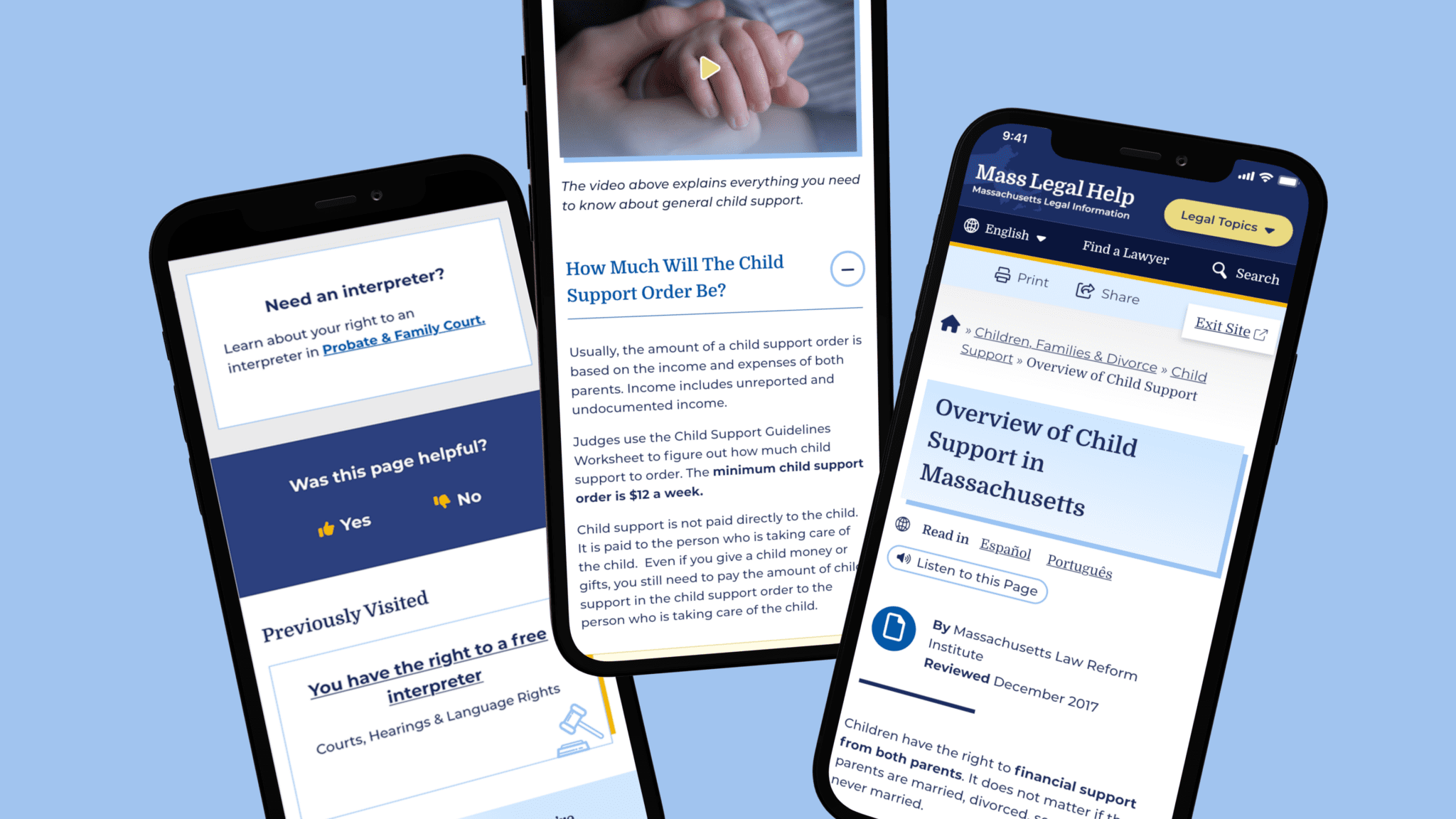
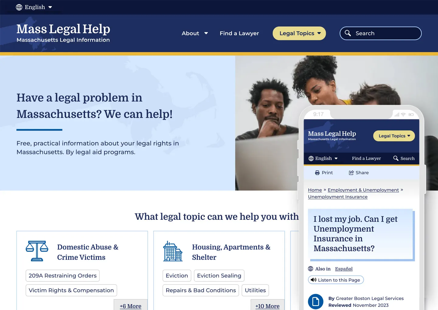
We learned that many visitors found the MLH website by searching Google with their questions. Many primary audience members would visit the site on their mobile phones, perhaps even listening to its content with their text-to-speech tool. This increased the importance of a mobile-first design so the pages loaded quickly, the information was clear, and the experience made sense for mobile browsing.
A Modernized Design
The site’s look was outdated, making some visitors feel that it either lacked credibility or didn’t contain the latest legal rules and laws (even though it’s been actively maintained and added to for the past 15+ years!). The final designs had to walk a fine line between being authoritative and trustworthy but comforting. We retained the blue color palette but created softer tones to create a calming aesthetic.
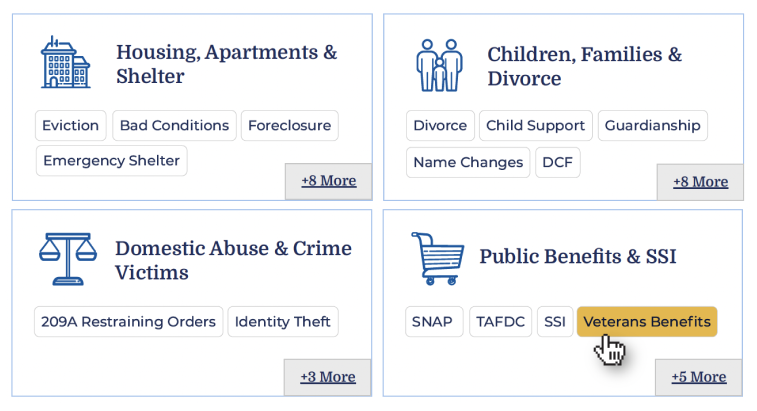 Our design did not rely on photography often, but when we did, photos had to represent the diverse groups MLH serves. Icons became a tool to guide the visitor through different topics as they don’t require translation.
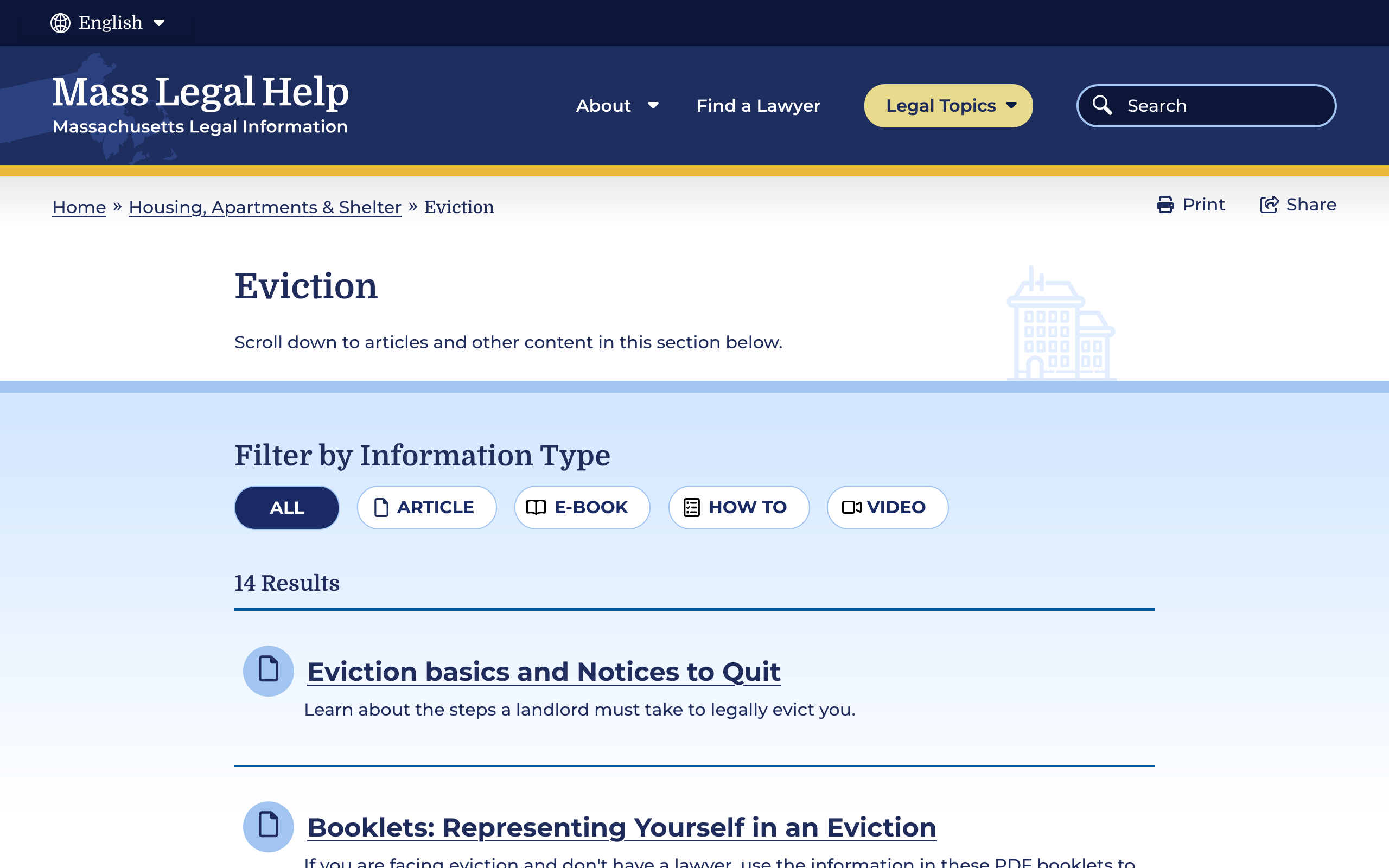
MLH has also accumulated a lot of content over the years. To help organize its search and topic organization feature, we incorporated content filters according to the information type: articles, how-tos, e-books, and videos. Each category has its own icon, and each icon is represented by a color. This helps unify the search based on the type of content the visitor is seeking.
Supporting the Content With Tools
MLH had several existing tools to assist in digesting content and we validated their need and upgraded them. For example, on content pages, there are options to print, share, listen to the content, and even switch the language as the visitor lands on the page.
Within the main navigation menu, the design included a “Quick Exit” button. This supports visitors who need to abandon the page when, for example, a domestic violence survivor’s abuser re-entered the room.
Proactive vs. Reactive Enhancements
Analytics and user interview results showed that most visitors start their journey on either the homepage or pages that are three or more levels down the navigation. Many also reach the site via a specific Google search. While it is likely they found what they needed, they may not be aware of other information that can help them. To mitigate the risk of bouncing away from the website, we created a “Viewers also reviewed…” component on answer pages that showcased related content more naturally.
A Modern, Helpful Website Design
Through prototype testing with our first design mock-up with real visitors, the participants individually determined that the new site’s design and content organization was easy to navigate, gave them a trustworthy impression, and looked appealing. Today, the MLH website is live with a fresh Oomph design. We hope the structure and design will continue to not only keep visitors on the site longer but also help those visitors find the legal answers that they need.
Have a project that requires a human-first, empathetic approach? Consider talking to Oomph about incorporating user feedback into a user experience-focused design project for your next website refresh.
Why Drupal was chosen
The previous site leveraged Drupal 7. The small editorial team maintaining the site decided to stay on the Drupal platform because it served their diverse needs. Oomph would be able to improve the authoring experience by streamlining the content model, which was one of the major concerns of staff. Drupal supported multi-lingual authoring, an accessible authoring experience, and was affordable for the non-profit to host and maintain.
Technical Specifications
Drupal version:
Key modules/theme/distribution used: