It does so through cooperative education, leadership, and research. Their old website, however, faced challenges with the user interface as well as the user experience. There were five major challenges:
- Outdated backend technology
- Poor content navigation and usability
- Web design was not responsive for mobile users
- Complicated content and editorial controls
- Accessibility issues with colors and redirections
The end objective was to create a platform that offers a responsive, intuitive user interface and user experience. A clearer information architecture and mobile-friendly interface would ensure great accessibility and user retention.
The East-West Center, or the Center for Cultural and Technical Interchange Between East and West, is an independent, public, nonprofit organization established by the U.S. Congress in 1960 to promote better relations and understanding among the people and nations of the United States, Asia, and the Pacific through cooperative study, research, and dialogue.
The Center serves as a resource for information and analysis on critical issues of common concern, bringing people together to exchange views, build expertise, and develop policy options. Guided by values of respect, innovation, and collaboration, the East-West Center aims to be a premier institution in the Indo-Pacific to convene, develop, and equip a network of leaders to solve challenges of common concern.
Over 60 years of serving as a US-based institution for public diplomacy in the Indo-Pacific region with international governance, staffing, students, and participants, the Center has built a worldwide network of 71,000 alumni and more than 1,100 partner organizations.
Working with our staff, the Axelerant team has been very helpful and supportive. They really seem to care about our success! - Mark McMahon- Information Technology Specialist, East-West Center
About the project
The Solution
Reimagining the entire experience for the website helped East-West Center attain the core business objectives of increased traffic and a solid web presence. Here’s how we executed the plan:
- UI and UX auditing
- Rendered modern designs through content architecture, wireframing, prototyping, and UI design that were in alignment with the East-West Center’s vision
- Tested the website with various tools for accessibility and made the fixes accordingly
- Recommended website upgrade from Drupal 7 to Drupal 9 to ensure security and accessibility
The Result
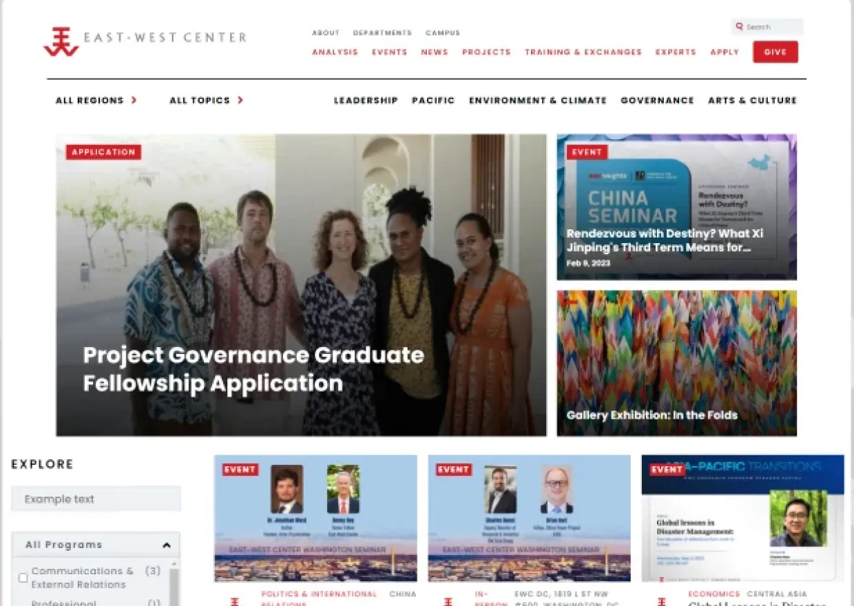
Together, we were able to deliver a clean, visually appealing, easily navigable website. The new design has successfully created a smooth experience for web admin as well as end-users. We now have:
Engaging User Interface
The minimalistic approach towards the user interface design has improved the website’s readability on mobile devices as well. Bolder, brighter design elements with a variety of images of students, alumni, researchers, and visitors enjoying the East-West Center have added more character to the website.
Better Action on Pages
The website witnessed a significant increase in clicks on applications for programs. Many new topic and region pages quickly made it to top-viewed pages. More users clicked through to donate to the East-West Center than on the old site.
Improved Browsing Experience
A well-structured information architecture and navigation made browsing faster, and smoother. The audience can now find relevant information quickly. User groups such as students, professionals, and research scholars can now discover educational programs with ease, resulting in increased course enrollment and revenue.
Improved Backend Operability
The East-West Center’s web admin team is able to navigate the Drupal backend seamlessly and update content in a streamlined manner. It now has a refreshed backend editor with more editing features.
Project Highlights
-
HOLISTIC COLLABORATIVE DISCOVERY
Together with the East West Center’s tech and non-tech teams, we started a collaborative discovery. We discussed the following in detail:
- Functions and objectives of the organization
- Audience segments they cater to
Problems with the current website - Desired improvements including fonts, content workflow, and information flow
- Earmarking the code that needed to be rewritten if we migrated to Drupal 9
- Determined unused contrib and custom modules that could be discarded
-
STREAMLINED PUBLISHING WORKFLOW
Creating separate configuration settings for the admin users made the page editor efficient. It now helps tech and non-tech backend users create customized pages with ease.
We started with creating unique pages for each content type and dedicated a template to each. A single basic page content type was combined with various content kinds.
The next step was to create templates that have moveable, interactive content blocks. The backend user editor can now add or remove these blocks to reflect the essence of what the East-West Center does.
-
RESPONSIVE MOBILE-FIRST APPROACH
The responsiveness of some page elements was not in place. The same elements would not function properly on mobile devices as they would on the desktop view. A major chunk of the website's users are the youth, looking for education and training opportunities. It was essential to make the website responsive not only for mobile view but also other devices.
We worked on a few things at the backend design so that every page is responsive.
- Choosing the right typography
- Change the page template to a modern, uncluttered style
- Optimizing the images for all views
-
IA & NAVIGATION RESTRUCTURE
Navigation menus need to be structured in a simplified way so that information is not stuck in program-siloes. It should also enable the users (those unfamiliar with the center’s departments) to find what they’re looking for by interest.
So, we redesigned the entire site navigation (header and footer) according to the information architecture and divided the header menus into Primary & Secondary Menus.
Social buttons such as Facebook, Instagram, Twitter, LinkedIn, YouTube, Flickr, Vimeo, etc., were placed at the footer to increase engagement and followership.
-
UI AND UX REFRESH
The placement of the logo was determined in tune with web, mobile and other user interfaces, making it persistently visible across all devices. We also standardized the location of secondary and tertiary logos.
Just like the center’s vision and mission, the visual branding needed to be clear, crisp, and inspiring. We had to ensure that the branding message conveyed intelligence, relevance, and expertise, while still keeping it aesthetically pleasing.
In short, the new design with bolder colors and logos website would make it easy for busy users to connect instantly and find useful information.
-
D7 TO D9 PLATFORM MIGRATION
An upgrade from Drupal 7 to the latest version of Drupal 9 was needed for better site security and operations. So, we proceeded to D9 migration after a thorough collaborative discovery led by our Drupal team. And our job was to secure maximum data during the migration.
We documented and implemented the following for a smooth migration:
- User Migration: D7 to D9 role mapping
- Migrating the content types per role mapping
- Migrate the existing media (files, images, videos, etc.)
- Configuration migration to D9
Database migration
-
TESTING FOR OPTIMIZING ACCESSIBILITY
Through User Accessibility Testing, we found the problems that were making accessibility a problem. We used Lighthouse and Colour Contrast Analyzer as primary tools for the validation of accessibility issues. We also went on to fix these problems on the frontend:
- Set background and foreground color contrast to an apt ratio
- Standardized the voiceover functionality to capture the date and each component on the teaser videos
- Ensured that the user is led to the right redirect while using the Tab key on the keyboard
- Switched to a darker shade of red in the logo to make it stand out as a strong brand
Why Drupal was chosen
The website exhibited six major problems for two user groups, end-users, and web admin.
Challenges for end-users:
- Poor Content Discoverability
The site was loaded with information without an appropriate visual hierarchy. This negatively affected traffic as well as session time.
- Confusing Navigation
The heavy nesting of navigation items and the grouping of irrelevant navigation items made it difficult for users.
- Outdated Visual Style
The overall outdated user interface of the website could not engage its primary users: young people looking for educational and training opportunities.
- Accessibility Issues
Issues concerning keyboard shortcuts, background and font colors, and browser functionality were making the website less accessible.
Challenges for web admin:
- Undefined Publishing Workflow
In the absence of a streamlined workflow, content authoring was tedious.
- Suboptimal Authoring Experience
Basic backend functionalities such as authoring, publishing, and editing content were too complex for non-tech admins.
Overall, we needed to create solutions to achieve:
- Better discoverability
- Information workflow
- ADA compliance
- Targeted market messaging
- Content publishing workflow
- Improved aesthetic appeal
- Increased traffic and user retention
Technical Specifications
Drupal version: